


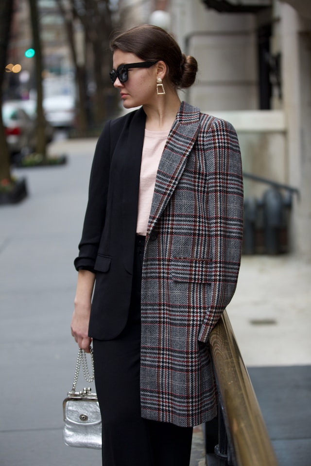
From fashion, interior design to graphic design and visual artistry, color coordination is crucial in any visual composition’s overall aesthetic appeal and effectiveness. Imagine going to your first day at work, and the colors you put on must be placed better together. People at work started creating unreliable assumptions about who you are, which may leave an indelible reputation. No matter how expensive your attire is, the color scheme may profoundly affect other’s perceptions and emotions toward you.
Worry no more; this article is here to help you get familiar with the color wheels and complement, which involves selecting and combining colors in clothing and accessories to create a visually pleasing and harmonious outfit.
How to Match Colors
1. Understand the Color Wheel
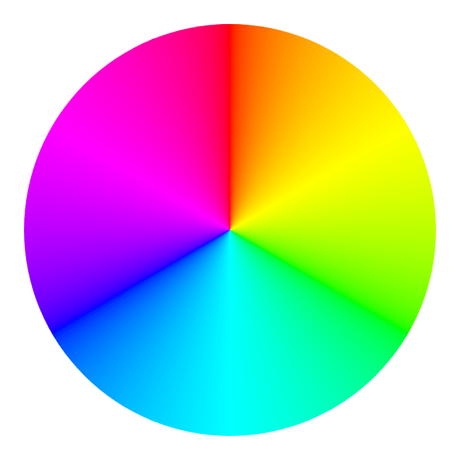

Invented to condense the color spectrum into the wheel primarily, the color wheel was established to present a color scheme relationship. It is divided into categories and focuses on creating a universal guideline for combining colors.
- Primary Colors
These fundamental colors cannot be created by mixing other colors. The primary colors in the traditional color wheel are red, blue, and yellow.
- Secondary Colors
Secondary colors are a combination of the primary colors. The secondary colors are green (blue+ yellow), orange (from red and yellow), and purple (from red and blue).
- Tertiary Colors
These are formed by combining equal parts of primary and neighboring secondary colors. Tertiary colors can be located between the primary and secondary colors they are mixed from. Mixing these colors gives you shades like mint, aqua colors, corals, red-orange, yellow-green, blue-purple, etc.
- Warm and Cool Colors

The color wheel can also be categorized into cool and warm colors. Warm colors like red, orange, and yellow evoke emotions of warmth and energy. Cool colors, like blue, green, and purple, create a calming and soothing atmosphere.
- Complementary Colors
They are pairs of colors opposite each other on the color wheel. Complementary colors create a strong contrast when placed side by side and can make each other more vibrant. Complementary include red and green, violet and yellow, blue and orange, etc.
- Analogous Colors
Analogous colors are placed next to each other on the color wheel. They share the same shades and can create a harmonious and soothing color palette.
- Triadic Colors
Triadic color schemes involve choosing three colors evenly spaced around the color wheel. This creates a sense of dynamism and contrast while maintaining balance.
- Split-Complementary Colors
This combination involves choosing a base color and then using two colors adjacent to its complementary color. This creates a visually exciting yet balanced combination.
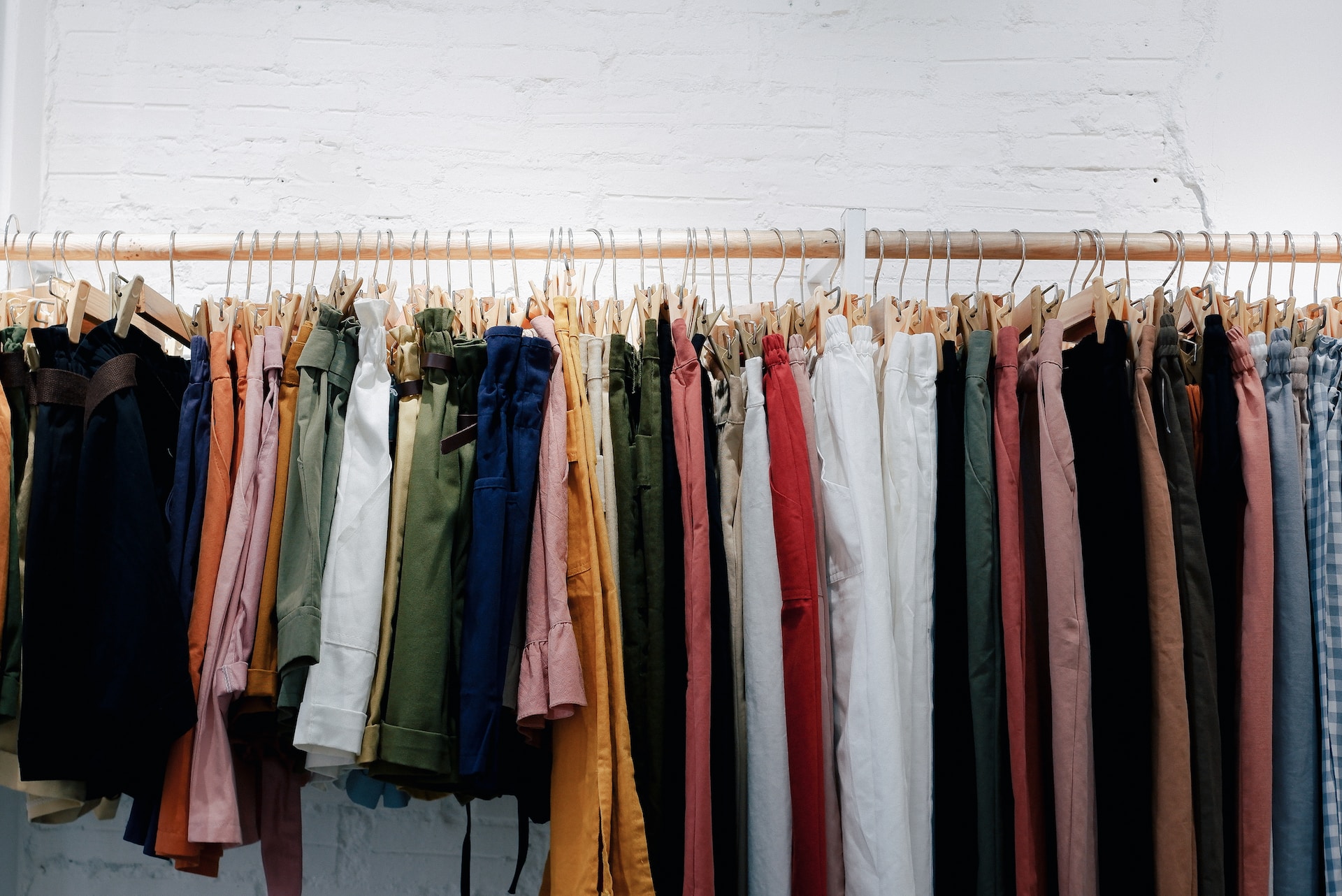
2. Know the Principles of Mix and Match
- Primary Colors
Primary colors are the foundation of your outfit and can set the tone for your entire outfit. When choosing primary colors for fashion, it’s essential to consider the season, style, and the overall look you want to achieve.
a. Black and White– timeless primary colors that work well in any season and for any occasion
b. Forest Green: deep, natural color worn in all seasons. It pairs well with neutral tones like black, white, gray, and other earthy tones.
c. Denim Blue: a classic primary color for casual and relaxed looks. It pairs well with a wide range of different colors and textures. Treat denim items as neutrals and combine similar but not identical denim colors, such as washed jeans with a light-wash denim shirt.
d. Ruby Red: bold red shades make a statement and exude confidence. They work well for evening occasions or events and can be paired with neutrals or metallics.
- Secondary Colors
Secondary colors can add vibrancy and variety to your outfits.
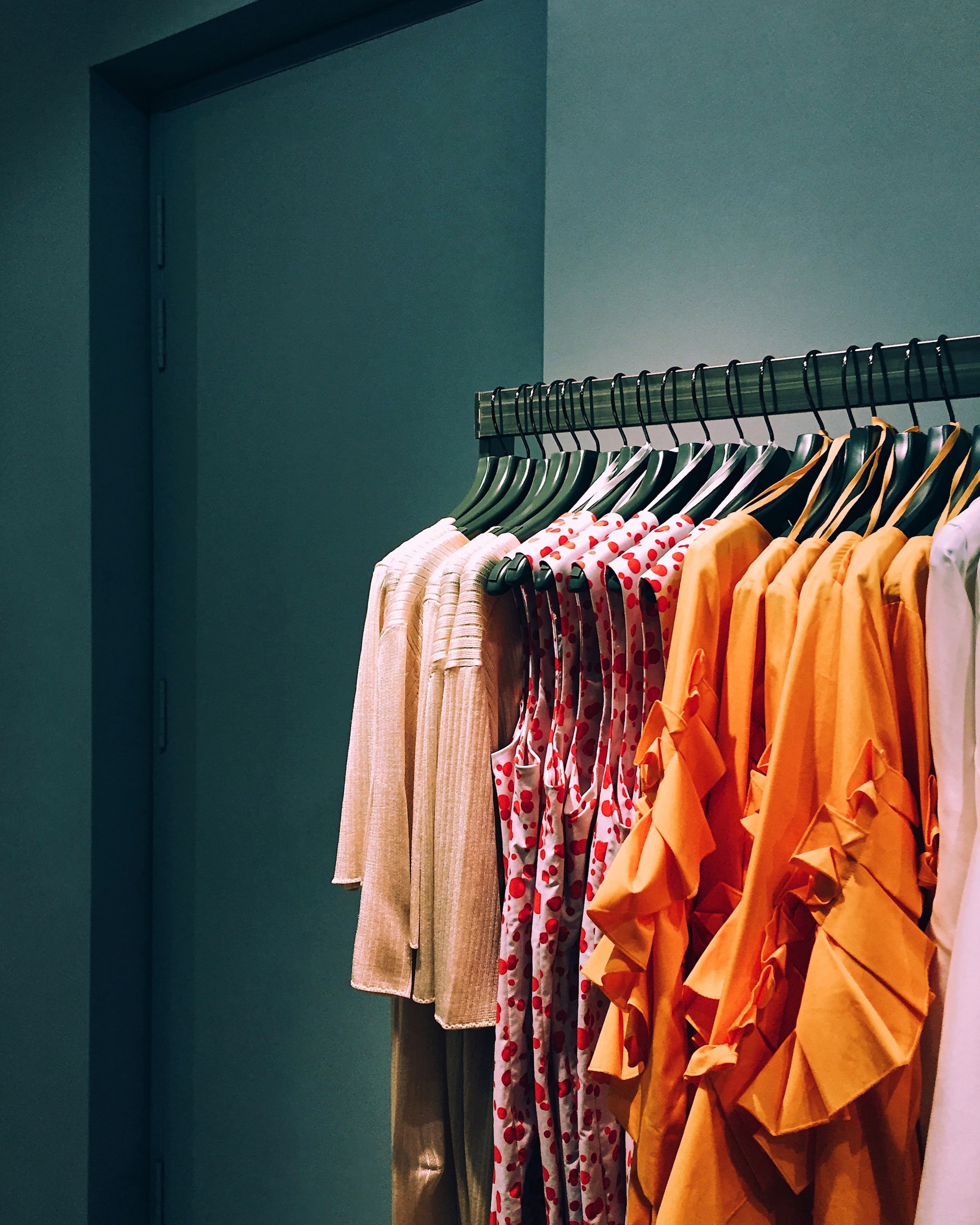
a. Orange: created by mixing red and yellow. It’s a warm and energetic color that can add a pop of brightness to your fashion choices.
b. Purple: often associated with royalty, creativity, and mystery. It can emphasize an added touch of elegance and sophistication to your fashion ensemble.
- Tertiary Colors
In the fashion industry, tertiary colors can add depth, complexity, and uniqueness to your outfits.
a. Yellow-Orange: a combination of yellow and orange creates this bright and cheerful color that is perfect for summer wear, dresses, or sportswear.
b. Blue-Green: a calm and serene shade that could work well for different matching attire such as dresses, blouses, or accessories.
c. Red-Purple: rich and intense hue that could be used in elegant dresses for formal occasions, skirts, and statement jackets.
- Warm and Cool Colors
Warm colors make things look smaller and slimmer in size, while cool colors, like hues of blue, purple, and green, create a calming and soothing atmosphere.
a. Purple Hue with Red: creates a warmer vibe for casual and elegant social events.
b. Warm Shades of Brown: tan, camel, and chocolate brown can create a cozy and earthy feel. They are versatile and can be used as neutrals or as the primary color in an outfit.
c. Blue and Green: different shades of blue can create looks ranging from casual to formal, while green can provide a refreshing and harmonious appearance.
- Complementary Colors
When using complementary colors in fashion, consider the intensity of the colors and how you can balance them. You can use one color as the dominant shade and the other as an accent or mix them in equal proportions for a bold, attention-grabbing look.
a. Blue- Orange: bold and exciting the complementary combination. Try a blue suit with an orange tie and square pocket, and your fashion statement is with flying colors.
b. Purple- Yellow: creates a rich and regal contrast. Try a purple blouse with a yellow skirt or accessories for an eye-catching mix and match.
c. Turquoise- Coral: associated with a beachy and tropical atmosphere. A turquoise swimsuit paired with a coral cover-up or accessories can evoke a fun and sunny vibe.
- Analogous Colors
It’s striking and stylish when you assemble an entire outfit in an analogous combination. If you are wondering how to wear an orange or camel coat, pick a color on either side of the color wheel and work with that.
a. Purple-Blue: combining shades of purple and blue, like lavender and periwinkle, with a lavender skirt and silver jewelry can create a dreamy and sophisticated appearance styled as an elegant outfit.
b. Red-Purple: a combination that can create a rich and dramatic effect. For example, a burgundy dress with magenta shoes and a black clutch can make a bold statement.
c. Yellow-Green: a fresh and lively choice; a good example is a lime green top paired with a yellow-green scarf and light gray pants, creating a balanced look.
- Split-Complementary Colors
The split complementary colors consist of two colors and one of their associated colors. A simple example of this correspondence is yellow, purple, and yellow-orange.
3. Identify Colors and their Creative Matches

- Neutral Basics
Black, white, brown, beige, and gray are neutral colors in women’s outfits. They work tirelessly to blend in with any other shade under the sun. They are simple background tones to figure out which colors go well with each other. They even pair well with more subtle shades like hazel.
- Navy Blue
For a modern look, experiment with color schemes for accents. A navy flared dress with bright orange strappy heels is fresh and fun. The only downside is that the deep navy blue can create a look out of touch to match true black. The trick is to make sure the two colors have different tones. Add depth and dimension with luxurious fabrics and textures, like silk.
- Olive Green
Olive is a versatile earthy neutral paired with almost any color. Hot pink, maroon, and dusty blue are the right choices. White is a decent choice when you’re looking for a pop of olive color. The ultimate chic flair is a patterned white shirt with olive skinny jeans and leather loafers.
- Pink
For a bold and bright combination, choose bold cobalt and fuchsia. Try a variety of baby pink and cornflower blue for a softer feel. Also, you can go right with pairing blue jeans with any shade of pink. Keep your style on trend with wide-leg denim and square-toe heels. Pink will be your instant choice for different events.
Color Coordination: Harmony and Balance

Color coordination involves selecting colors that complement each other and work together seamlessly. You often want to incorporate color into your outfit strategically. You can’t just pick two complementary colors and use one for the pants and one for the top. The outfit might be out of place.
A good rule of thumb is to divide the top and bottom of your outfit into dark and light colors. For example, you could wear a more golden color on top (shirt, blazer, jacket, etc.) and a darker color underneath (pants, shorts).
Further, high contrast can bring out some aspects by placing complementary colors next to each other or combining dark and light colors. This technique is often used in graphic design, where bold text on a vivid background will immediately attract attention. On the other hand, low contrast can create a softer and more subtle effect, helping to convey a sense of elegance or calm.
Conclusion
Remember that fashion is a form of self-expression, and there are no hard and fast rules regarding color coordination. You can create visually pleasing and unforgettable impressions by understanding how colors work together and how they can be effectively contrasted. It’s about balancing aesthetics, personal taste, and the message you want to convey through your clothing.